/

Harvest Homepage

Reconciling conversion and brand

The Harvest homepage converted well, but years of optimisation had left it feeling fragmented. Built from a collection of winning experiments, it no longer told a clear story. The challenge was to keep what worked while making the page feel coherent again.

Company

Harvest

Year

2025

Location

New York, NY

Engagement

In-House

Role

Strategy

Creative Direction

Web Design

Copywriting

Background

A homepage designed by testing

By spring 2025, Harvest had been running conversion tests on the homepage for years, and they had worked. The incremental improvements added up, and the page converted better than it used to.

But it had also been built one test at a time. Elements that had won in isolation were added to the page over the years, often without being reconsidered as part of a whole. Over time, the homepage started to feel fragmented and less representative of the product and brand.

The goal was to bring the page back together, tell a clearer story, and preserve the conversion gains years of testing had delivered.
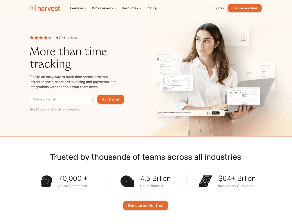
The hero had a vague headline and a stock photo that didn’t represent the brand, but the screenshots in the hero and trust markers near the top had tested well.

The hero had a vague headline and a stock photo that didn’t represent the brand, but the screenshots in the hero and trust markers near the top had tested well.

The page jumped into a three-step section that explained how Harvest worked in depth before it described the features. But showing details of the product’s UI had also won in testing.

The page jumped into a three-step section that explained how Harvest worked in depth before it described the features. But showing details of the product’s UI had also won in testing.

Combining elements from different winning designs led to inconsistencies in language, typography, and visual style.

Combining elements from different winning designs led to inconsistencies in language, typography, and visual style.

We had two sections about customer proof, telling a similar story from different angles, both stacked on top of each other.

We had two sections about customer proof, telling a similar story from different angles, both stacked on top of each other.

Approach

Reconciling the winners

The years of testing had left us with a collection of elements that performed well but hadn’t been designed to fit together. Some reinforced each other, but others repeated information or pulled the story in different directions. We had to decide what still deserved a place and what needed to be cut.

We kept the elements that had performed and still fit the story. Real product screenshots instead of the all-black illustrations the brand used to lean on, customer proof near the top, benefits before features, review badges and trust markers that showed Harvest was a widely-used product.

We cut the parts that muddled the flow of the page. The main problem was a long “how it works” walkthrough that appeared before the features, explaining the detailed mechanics of using Harvest before establishing why someone should care. We also removed a second customer section that repeated information already covered elsewhere, simplified the visual system, and replaced the stock photo in the hero with the product itself.

We introduced a clearer narrative focused on the outcome Harvest helps teams achieve. The old headline (“More than time tracking”) was too broad and didn’t say much about the product, so we led with what it helps teams achieve instead: Turn hours into profit. We built the rest of the page around that idea so that each section supported the main claim.

The new structure moved from why Harvest to what it does and closed with proof that it works. Features became benefits and were supported by specific product screens. We also introduced a product video and highlighted integrations, giving people more ways to understand how Harvest fits their workflow and business.

Outcome

The new homepage actually won

We tested the new page against the old one with the modest goal of not hurting the conversion rate we had managed to build over the years. The old page already converted well, so the new one only needed to hold steady while giving a clearer picture of what Harvest is. Instead it beat the control by 22%.

I had expected a clearer, more consistent page to be better for the brand, not necessarily for conversion. But the things we’d cut for the sake of coherence ended up not costing anything. A clearer story turned out to perform better too, and the page became the new control for future tests.

A year earlier, Harvest’s content was good quality but had no voice. It was mostly useful product notes and practical posts shaped around search terms. By the middle of 2025 that had changed. The content had a point of view, sourced from real data and real practitioners.

And even though it wasn’t built to chase traffic, the numbers looked good too. The AI report reached a 66% completed-download rate, webinar attendance doubled, and the program pulled in an audience that had no particular reason to care about time tracking software and gave them a reason to come back.

PROJECT CREDITS

This project was part of my tenure as Creative Director at Harvest. The team:

Israel Alonso - Strategy, Creative Direction, Web Design, Copy.

Zach Anderson - Web Development.

Molly Connor - Copy.

Cameron Fitchett - Product Marketing.

Andie Figlin - Demand Generation.

This project was part of my tenure as Creative Director at Harvest. The team:

Israel Alonso - Strategy, Creative Direction, Web Design, Copy.

Zach Anderson - Web Development.

Molly Connor - Copy.

Cameron Fitchett - Product Marketing.

Andie Figlin - Demand Generation.

Working on something?

hello@firesidestudio.com

Copy email address

A quarterly dispatch from the studio:

Working on something?

hello@firesidestudio.com

Copy email address

A quarterly dispatch from the studio:

Working on something?

hello@firesidestudio.com

Copied

A quarterly dispatch from the studio: