An antidote to serious analytics
Weyland Swart built a privacy-focused alternative to Google Analytics, and he needed an identity that would help it stand out from the other alternatives that all looked pretty much the same.
Company
Silly
Year
2025
Location
Portugal
Role
Brand Identity
Brand Guidelines
Logo Design

Strategy
Different from the differentiators
Open the leading alternatives to Google Analytics side by side and the similarities become hard to ignore. Early challengers like Plausible and Fathom arrived with clean SaaS aesthetics, muted colour palettes, and understated typography, making the category feel surprisingly uniform despite their different offering.

For Silly, standing out from Google Analytics was the easy part. It was already simpler, friendlier, privacy-focused, and GDPR-compliant. The harder part was standing out from everyone else who’d already done that.
The opportunity was to compete on personality and provide a contrast to serious SaaS branding, building trust through warmth instead of polish.
Weyland chose the name because he believes analytics doesn’t have to feel intimidating. My job was to turn that idea into an identity that embraced its playfulness without sacrificing credibility.
BRAND IDENTITY
Friendly but trustworthy
For a SaaS brand, friendliness is a fine line. When businesses rely on your product to make decisions every day, personality can’t come at the expense of trust. The challenge with Silly’s identity was to bring warmth and joy to analytics without undermining the confidence users place in the product.
Logo
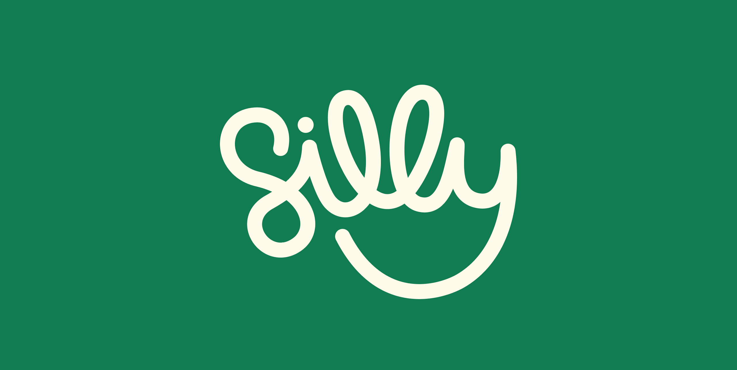
The wordmark is hand-drawn and deliberately imperfect, set in a single continuous stroke. The descender of the “y” loops back to meet the “i”, aligning with its dot to create a subtle sense of closure. The overall shape hints at both a smile and a chart line without being cartoonish or overly literal, while the two “l”s sit at different heights, breaking with the geometric precision that defines so many SaaS wordmarks.
Colour
The palette centres on a warm green, a deliberate move away from the sea of purple that dominates modern SaaS. It feels calm without being corporate, and in an analytics context it carries an added meaning: green is the colour of growth, of numbers going up. Pink accents soften the palette and bring warmth.

Typography
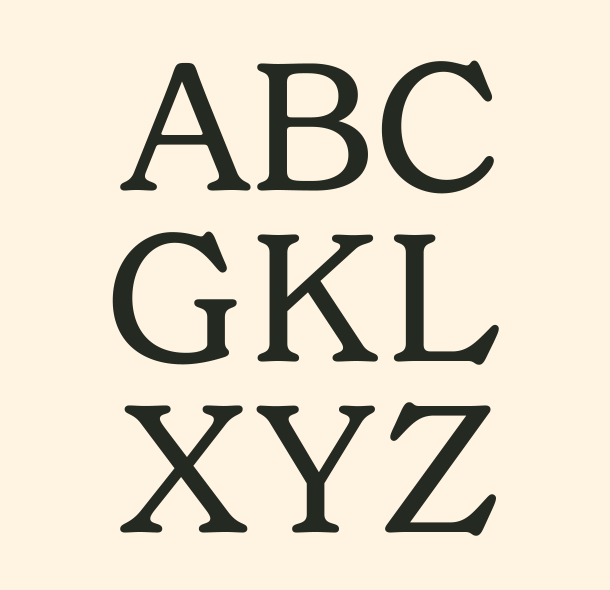
Most analytics tools set their numbers in tight sans-serifs or monospaced fonts, borrowed from the visual language of finance terminals. Silly uses New Spirit instead, a soft serif that makes charts and dashboards feel a little less intimidating. The same typeface carries headlines, paired with Satoshi as the workhorse for UI and body copy.

Voice and Tone
Analytics tools tend to dress up simple ideas in technical language: bounce rates, conversion funnels, attribution windows. Silly does the opposite, favouring plain English and direct copy over jargon. The hero asks, “How’s your website doing?” It sounds like something a real person would say and tells you exactly what the product is for.

Patterns
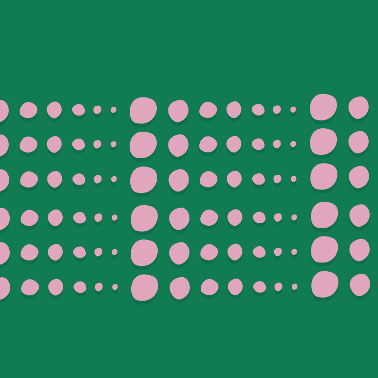
Rather than relying on elaborate illustrations, Silly uses a small set of imperfect patterns inspired by charts and graphs. They add texture and create a subtle connection to the product without dominating the identity, appearing as accents throughout the brand.



APPLICATIONS
Putting the brand to work
The identity had to work across the product, website, and marketing. Each surface called for a slightly different expression, but the goal stayed the same: make analytics feel approachable without losing the confidence people expect from a tool they rely on every day.

User Interface Style Direction
The product UI avoids the clinical feel that often comes with flat design. Buttons sit slightly above the surface with crisp shadows, giving the interface a subtle sense of depth, as if lit from above. New Spirit carries the large numbers, softening dashboards that could otherwise feel cold. The result is layered and tactile without slipping into skeuomorphism, with hover and active states that add a touch of delight while keeping the interface clear and easy to use.

Website Direction
The website opens on a bold block of green, immediately setting it apart from the sea of blue and purple that dominates the category. The hero asks, “How’s your website doing?”, putting the brand’s plainspoken voice front and centre. From there, the site stays warm, spacious, and uncluttered.

Brand Guidelines

PROJECT CREDITS
Weyland Swart - Founder. Product Design, Development.
Israel Alonso - Brand Identity